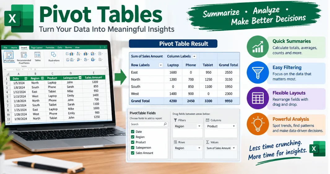
Pivot tables turn large spreadsheets into useful summaries without requiring complex formulas. You can group records, calculate totals, compare categories, and filter results within minutes. They are especially useful for sales reports, budgets, inventories, marketing data, and other repeated records.
If your spreadsheet contains hundreds or thousands of rows, pivot tables can make analysis much easier. Microsoft describes them as interactive tools for summarizing and exploring large amounts of data. They let you reorganize the same source information without changing the original records.
Direct answer: A pivot table summarizes spreadsheet data by grouping records and calculating values such as totals, counts, or averages. In Excel, select your source data, choose Insert > PivotTable, select a location, and arrange fields under Rows, Columns, Values, and Filters. You can rearrange those fields whenever your reporting question changes.
| Key point | What it means |
|---|---|
| Main purpose | Summarize and analyze spreadsheet data. |
| Common calculations | Sum, count, average, minimum, maximum |
| Main field areas | Rows, Columns, Values, Filters |
| Common uses | Sales, expenses, inventory, operations, marketing |
| Popular software | Microsoft Excel and Google Sheets |
| Formula knowledge required | Usually none for basic reports |
| Important maintenance | Refresh reports after source data changes |
What Is a Pivot Table?
A pivot table is a reporting tool that creates a summarized view of a larger dataset. Instead of manually writing formulas for every category, you arrange fields to answer specific questions. The original records remain separate from the summarized report.
Suppose a U.S. retailer has 20,000 order records covering products, states, dates, salespeople, and revenue. A summarized report could show revenue by state, monthly sales by product, or orders by salesperson. Changing the arrangement lets the same dataset answer different business questions.
This flexibility explains the word “pivot.” You can move fields between rows and columns to view information from another angle. The calculations adjust around the arrangement you choose.
Why Are Pivot Tables Useful?
Large spreadsheets often contain more detail than someone needs for a specific decision. Reading individual records makes patterns difficult to spot, especially when categories repeat thousands of times. A summarized report condenses those records into information you can compare.
They also reduce dependence on long collections of formulas. You can calculate sums, counts, and averages through field settings instead. Microsoft also supports filtering, grouping, custom calculations, and visual PivotCharts.
This makes the feature useful for recurring business reporting. Teams can examine regional performance, product results, expenses, support tickets, or campaign activity. Technoloss also covers how businesses use data for targeted campaigns when analyzing performance information.
How Pivot Tables Organize Your Data
Most basic reports depend on four field areas: Rows, Columns, Values, and Filters. Understanding these areas makes building reports much easier. Each area controls a different part of the final summary.
- Rows: Display categories vertically, such as products, departments, or states.
- Columns: Split results horizontally, such as months, quarters, or years.
- Values: Calculate numerical results, including sums, averages, and counts.
- Filters: Limit the report to selected records without changing the source.
Imagine a sales file containing State, Product, Quarter, and Revenue columns. Put State under Rows, Quarter under Columns, and Revenue under Values. The report now compares revenue across states and quarters.
You could then place the product under Filters. Selecting one product would narrow the entire report to that item. This arrangement can answer a new question without rebuilding the source spreadsheet.
How to Create Pivot Tables in Excel Step by Step

Creating pivot tables in Excel starts with well-organized source data. Microsoft recommends tabular data with columns, a single header row, and consistent data types. Blank headers, merged cells, and inconsistent columns can cause confusing results.
- Prepare the source data. Give every column a clear and unique header. Keep one record on each row and one type of information in each column.
- Select the data. Click a cell within the dataset or select the required range. Converting the source into an Excel Table can help the range expand with new records.
- Insert the report. Open the Insert tab and select PivotTable. Confirm the table or range shown in the dialog box.
- Choose its location. Select a new worksheet for a clean workspace. You can also place the report on an existing worksheet.
- Arrange the fields. Drag available fields into Rows, Columns, Values, and Filters. Start with one category under Rows and a numerical field under Values.
- Choose the calculation. Check whether Excel uses Sum, Count, Average, or another calculation. Change the Value Field Settings when the default does not answer your question.
- Format and review. Apply appropriate number formats and useful filters. Compare the final totals against the source before sharing the report.
Microsoft says numeric fields normally go into Values, while nonnumeric fields generally go into Rows. Dates can be placed in Columns depending on the chosen arrangement. You can manually move any field when Excel’s automatic placement does not fit your report.
A Practical Sales Example
Consider a company with sales records for California, Texas, Florida, and New York. Each row records an order date, state, product, salesperson, and revenue. Management wants to compare quarterly revenue across states.
Place State under Rows and Quarter under Columns. Add Revenue to Values and confirm that the calculation uses Sum. The resulting grid provides a compact state-by-quarter revenue report.
Now add the product to Filters. A manager can switch between product categories without editing formulas or duplicating worksheets. This approach also pairs well with other tech tips for better employee productivity that rely on organized information to support operational decisions.
Sum, Count, or Average: Choosing the Right Calculation
A summarized report is only useful when its calculation matches the question. Sum works well for revenue, expenses, units, and other additive values. Count is better when you need the number of transactions, customers, incidents, or records.
Average can reveal typical order values, response times, or scores. Minimum and maximum calculations help identify extreme values within a category. Always confirm the calculation instead of assuming the default is correct.
Excel commonly uses SUM for a numeric Values field. If Excel interprets that field as text, it may display “Count” instead. Microsoft recommends keeping data types consistent within each source column.
How to Refresh a Report When Data Changes
An Excel report may not immediately reflect changes made to its source. Microsoft instructs users to refresh after adding or changing source data. You can right-click within the report and choose Refresh.
A second problem appears when new records sit outside a fixed source range. Refreshing will not necessarily include rows that were never part of that range. Using an Excel Table as the source helps the data range expand as records are added.
Build refreshing into your reporting routine before sharing results. Check the source range and verify a few totals against the raw data. This simple review reduces the chance of distributing an outdated summary.
Common Problems and How to Fix Them
Spreadsheet reports can look convincing even when their setup is wrong. That makes source-data quality and validation important. Most beginner problems can be traced to a few predictable issues.
| Problem | Likely cause | Practical fix |
|---|---|---|
| New records are missing. | The source range excludes them. | Update the source or use an Excel table. |
| Values show count. | Numbers are stored as text. | Clean the column and select Sum. |
| Old totals remain. | The report has not been refreshed. | Refresh after changing source data. |
| Fields look confusing. | Headers are missing or duplicated. | Give every source column a unique header. |
| Categories are inconsistent. | Source labels contain variations. | Standardize names before analysis. |
Cleaning the source before building the report saves troubleshooting later. Keep categories consistent and avoid inserting manual subtotals into raw records. If data management is becoming more complex, Technoloss has additional coverage of database conversion and data migration.
Pivot Tables in Google Sheets
Google Sheets also supports summarized spreadsheet reports. Google says each source column needs a header before creating one. Users can then add rows, columns, values, and filters through the editor.
The basic concept is similar across Excel and Sheets. Both tools let you group categories and aggregate numerical information without rewriting the underlying dataset. Interface details differ, so the exact commands depend on the spreadsheet application.
Google Sheets can be convenient when several people collaborate through a browser. Excel offers extensive desktop analysis features and connections to tools such as the Data Model. Your existing workflow and data requirements should guide the choice.
Pivot Table vs. Regular Formulas
Neither approach replaces the other. Formulas are useful when you need a fixed calculation placed in a specific cell or report layout. Summarized reports are better when you want to rearrange categories and explore the same dataset quickly.
A formula-based dashboard may provide tighter control over presentation. An interactive summary is often faster for exploratory analysis and recurring questions. Many practical workbooks use both methods for different purposes.
Start with the question you need to answer. If you expect to group the same records by several categories, an interactive summary often saves time. If the output must remain in a fixed format, formulas may provide more control.
Tips for Better Spreadsheet Analysis
Good source data matters more than decorative formatting. Use descriptive headers, consistent categories, and reliable numeric formats before building reports. Avoid blank rows inside the dataset because they can complicate analysis.
Keep the raw records separate from presentation sheets when possible. This makes the source easier to audit and protects it from accidental formatting changes. It also creates a cleaner reporting workflow for teams.
Finally, document how recurring reports should be refreshed and checked. Training users on simple workflows can reduce avoidable reporting errors. Technoloss has a guide on how to help your business tech run more smoothly, which covers technology and staff training for efficient operations.
Frequently Asked Questions About Pivot Tables
What are pivot tables used for?
Pivot tables are used to summarize, group, compare, and filter spreadsheet records. They can calculate totals, counts, averages, and other summaries across categories. Common examples include sales reports, expense analysis, inventory summaries, and operational reporting.
Do I need formulas to create one?
You usually don’t need formulas for basic summaries. The spreadsheet application performs standard calculations based on fields placed in the Values area. More advanced analysis may still use formulas, calculated fields, or additional data tools.
Why does Excel show Count instead of Sum?
Excel may use Count when it interprets a field as text instead of numeric data. Check the source column for text entries, inconsistent values, or other formatting problems. You can also change the calculation through Value Field Settings.
Do reports update automatically when source data changes?
You should refresh an Excel report after changing its source information. New rows can also be missed when they fall outside a fixed source range. An Excel Table provides a more dependable expanding source for recurring datasets.
Can I use the same feature in Google Sheets?
Yes, Google Sheets supports this type of spreadsheet analysis. You select source cells, insert a new summary, and configure rows, columns, values, and filters. Google also provides suggested layouts for some datasets.
Start With One Question, Then Build the Report
The easiest way to learn this feature is to start with a specific business question. Ask for total sales by state, orders by month, or average revenue by product. Then arrange the fields needed to answer that question.
Once the first report works, experiment with filters, different calculations, and alternative field arrangements. Always refresh and validate important reports before sharing them. For more practical software and technology guidance, explore the Technoloss software section.